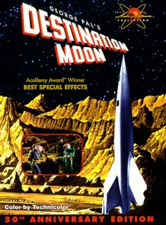
Although certainly dated, I'm glad I took the time to watch the 1950 classic
Destination Moon. I discovered it in my
Netflix recommendations listing, and once I read that the screenplay was co-written by
Robert A. Heinlein, and based on his novel
Rocketship Galileo, not checking it out was impossible.
One of the first Sci-Fi movies ever released in color, it won Academy Awards for its special effects.
Watching it will make you wonder why though.
Despite its Technicolor glory, I could hardly tell the difference between what I knew should be distinctly blue and distinctly green, and I’ve seen video podcasts that would rival its special effects – but that’s missing the point.
A serious film of its day, it made the case for how and why
America would go to the moon – decades before mainstream
America believed it possible.
Unlike most Sci-Fi of its era, this film is not so terribly silly or absurd when viewed in a modern light. Instead it’s rather remarkable in how much it managed to get right. All things considered, the movie has held up admirably – losing its fantastical Sci-Fi edge only in that so much of it was destined to become historical fact. Aside from its sleek V-2 looking shape and obligatory ‘atomic engines’ most elements of the spacecraft were realistically devised and explained – even if through, what now seems like, amateurish special effects.
What struck me most about this film however, were its opening credits: A field of stars over which was superimposed rolling text which receded into the distance as it scrolled. You can’t watch it without immediately thinking StarWars. It occurred to me that George Lucas must have been paying homage to a classic film from his youth - one that remains a milestone classic today.
 I discovered Thinking Machine 4, an online chess game / art project, thanks to the handy link provided by Quantum Blog. I've played against a lot of different online chess opponents but none quite like this one.


